I had a little free time on my hand and decided to quickly complete the coursera-course „Data Science at Scale – Practical predictive analytics“ of the University of Washington by Bill Howe. The last assignment was to participate in a kaggle competition.

For this assignment I chose the „San Francisco Crime Classification“ challenge. The task is to predict the Category of a crime given the time and location. The dataset contains incidents from the SFPD Crime Incident Reporting system from 2003 to 2015 (878049 datapoints for training) with the following variables:
- Dates – timestamp of the crime incident
- Category – category of the crime (target variable) – 39 different categories
- Descript – detailed description of the crime incident (only in training set)
- DayOfWeek – the day of the week
- PdDistrict – name of the Police Department District
- Resolution – how the crime incident was solved (only in training set)
- Address – approximate address of the crime incident
- X – Longitude
- Y – Latitude
The results will be evaluated using Logarithmic Loss (logloss). In order to calculate the logloss, the classifier needs to assign a probability to each class (instead of just outputting the most likely one). These probabilities have to be calculated on test.csv, a dataset that does not contain labels, descriptions or the resolution of the crime, and submitted as a csv-file with header.
Over all the N datarows, the mean of the log of the probability that the classifier assigned to the true label is calculated ( see also: [1,2]):
, \\ N & = & \#datarows, \\ M & = & \#labels, \\ y & = & binary\:indicator, \\ p & = & probability\:assigned\:by\:classifier\end {array}")
If the probability has been near zero for the correct label, this will be a very large number (log(0) is undefined, so usually the smallest representable is taken). If the probability assigned to the correct label is 1, the log of that is 0. If the classifier assigns uniform probability to each of the labels, the logloss will be (in this case) log(1/39), which is 3.66. The mean of these values over all datarows is the final logloss value for our classifer.
Visualization and Pre-Processing
As a first step, I visualized the variables of the dataset to get an understanding of the involved variables, and identify which variables could be used to differentiate between crime-categories.
(you can see some sample illustrations here: https://github.com/TobiasWeis/kaggle_sf_crime).
Here I noticed that 67 of the coordinates were far out (-120.5, 90.), so I removed those outliers.
By plotting the X/Y variables on the map of SF, I could see that the majority of crimes are concentrated on the north-east area, and that different crimes have slightly different spatial distributions. Also, the timestamp seems to be a good indicator, different crimes seem to have different days and times at which they tend to happen most often, which might give additional hints to the classifier.
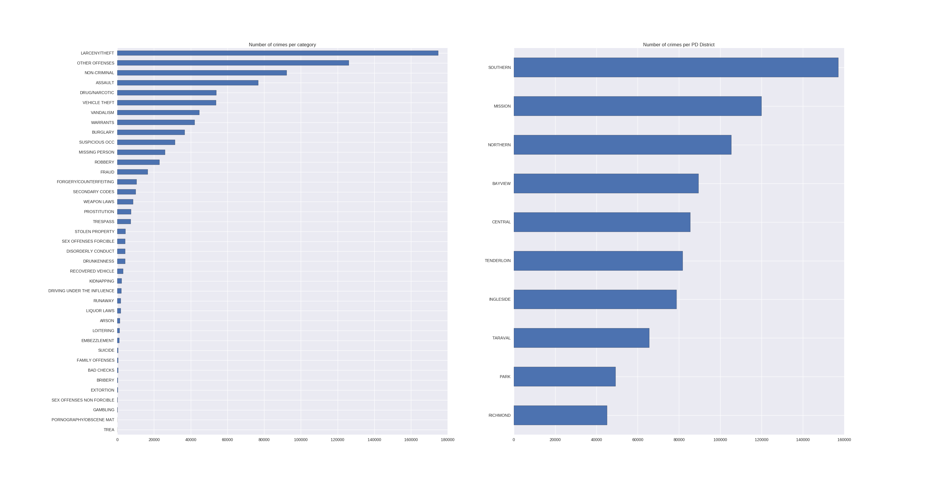
The histogram of the categories revealed that there exists a clear ordering in the amounts of different crimes. The top 6 in descending order:
- Larcency/Theft
- Other Offenses
- Non-Criminal
- Assault
- Drug/Narcotic
- Vehicle Theft, …
And here is the graphic, together with a histogram over the number of crimes per PdDistrict:
 Let’s see which other dependencies and patterns we can find in the data, shall we? For visualization I chose the top 5 crime-categories and plotted their crimes depending on the values of the variables (or features):
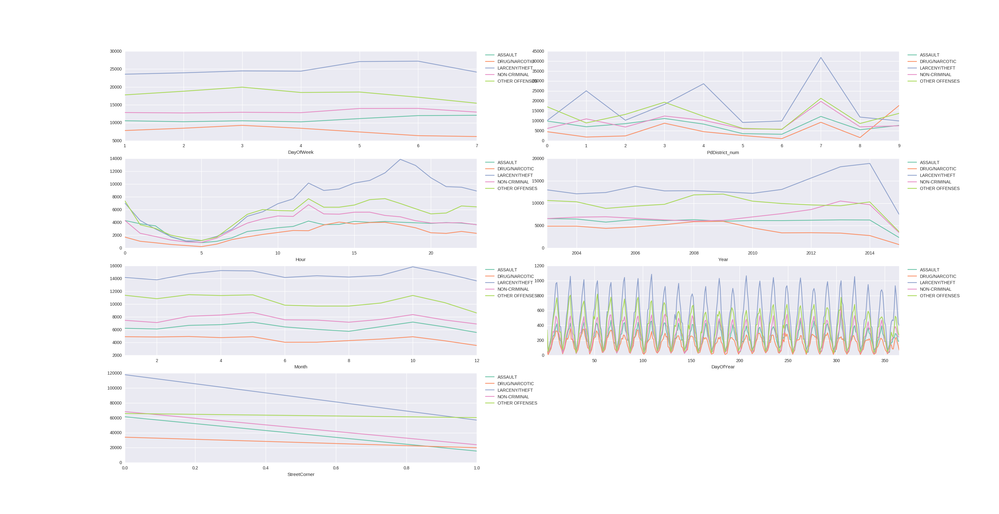 A very strange pattern in the DayOfYear-Values, but I cannot yet explain where these come from. If you have tips, please leave a comment!
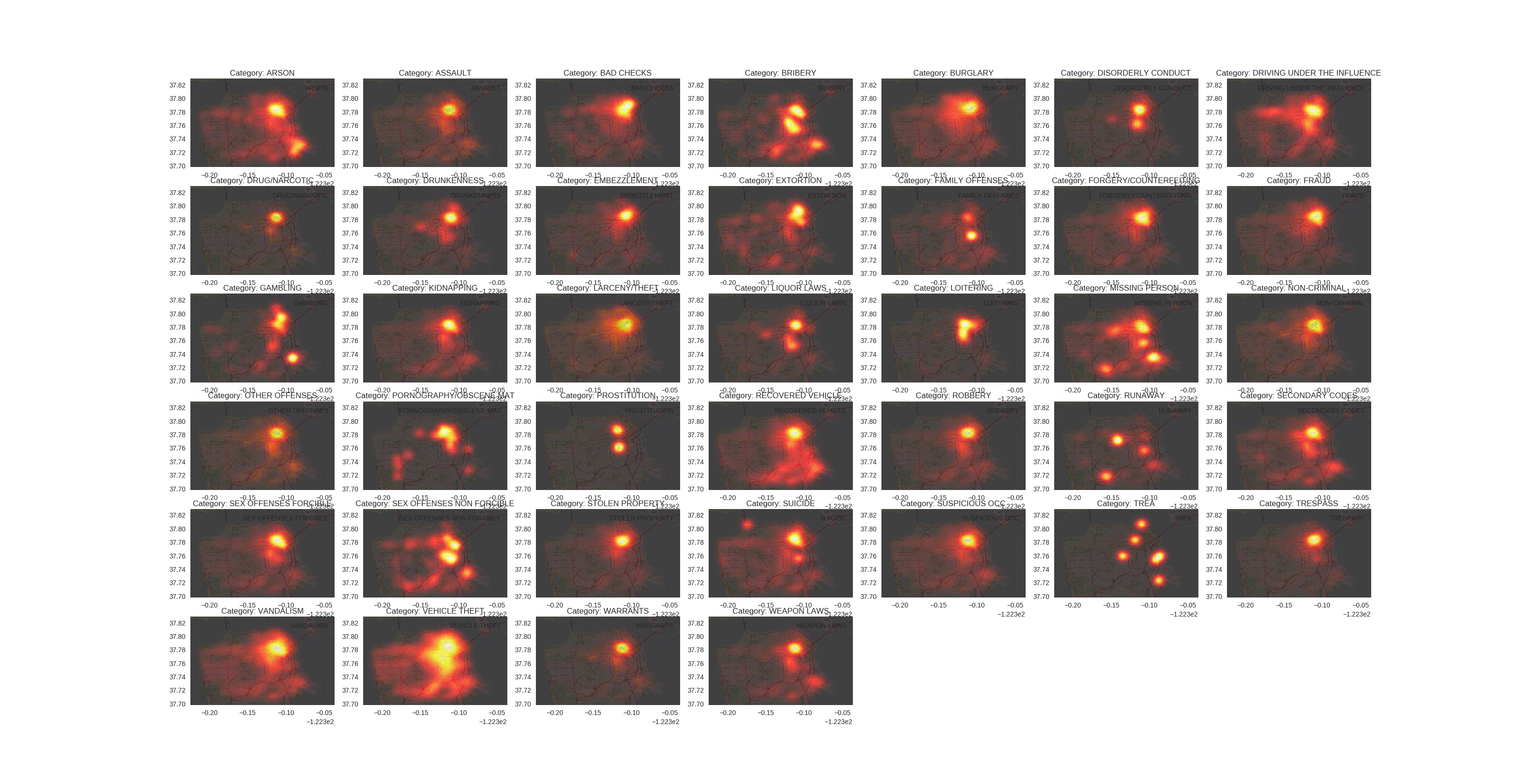
And last but not least, some eye-candy, let’s visualize the „hotspots“ of the different crimes in the SF area:
 I chose to use python, pandas and sklearn for this problem (and a little bit of R, especially the ggmap package to get map data). For plotting I relied on matplotlib and seaborn.
Preprocessing
- I decided to encode all features into numerical variables.
- The order of the weekdays was random, so I transformed them to range from 0 (Monday) to 6 (Sunday).
- For the PdDistricts I used the pandas functions to first transform them to categoricals and then get their index.
- For the dates i also had pandas preprocess those for me, so I could directly access Day,Month,Year,Hour, etc. instead of coding this by hand.
Baseline
In order to get an understanding of the loss-function used, I first calculated the loss of two baseline ideas:
- Uniform probabilities for all classes: 3.66
- Always choose the most common category (LARCENY/THEFT, 174900 vs. Rest 703149), setting 0 proba as 1e-15 as log(0) is not defined: 27.66
This also tells that wrong choices with high probabilities get penalized pretty hard.
Classifier training
First I split the training data into train- and test-set (.9/.1), making sure to set the random state to a fixed value to ensure reproducability.
But the standard parameter-values of all classifiers performed poor on average, so I ran a random parameter search instead (sklearn.RandomizedSearchCV) over a wide range of parameters on each classifier/feature set before reporting scores. I did not split the data anymore, as the RandomizedSearchCV is using cross-validation internally. Furthermore, I replaced the scoring-function of the RandomizedSearch by the log-loss function to directly search for best options for this specific problem).
As we have been talking about them in the lecture, I first used a single Decision Tree on the features DayOfWeek, PdDistrict, Hour, which resulted in a score of 2.62. I chose this feature set because it already captured some aspects of time and space and was computationally cheap (basically only some categorical integer variables).
Please note that the scores reported are those that were reported by the RandomizedSearchCV, not on the Kaggle leaderboard.
Results
For the sake of completeness, here are the feature-sets I tried and the scores they achieved with different classifiers (I wrote a script that iterates through the feature-sets, performs a random search for each classifier and saves the result to a logfile):
Evaluation against kaggle leaderboard
I wrote a small script that would parse the kaggle leaderboard for me, so I could build some statistics with it and see how well i did in comparison (https://github.com/TobiasWeis/kaggleLeaderboardStats).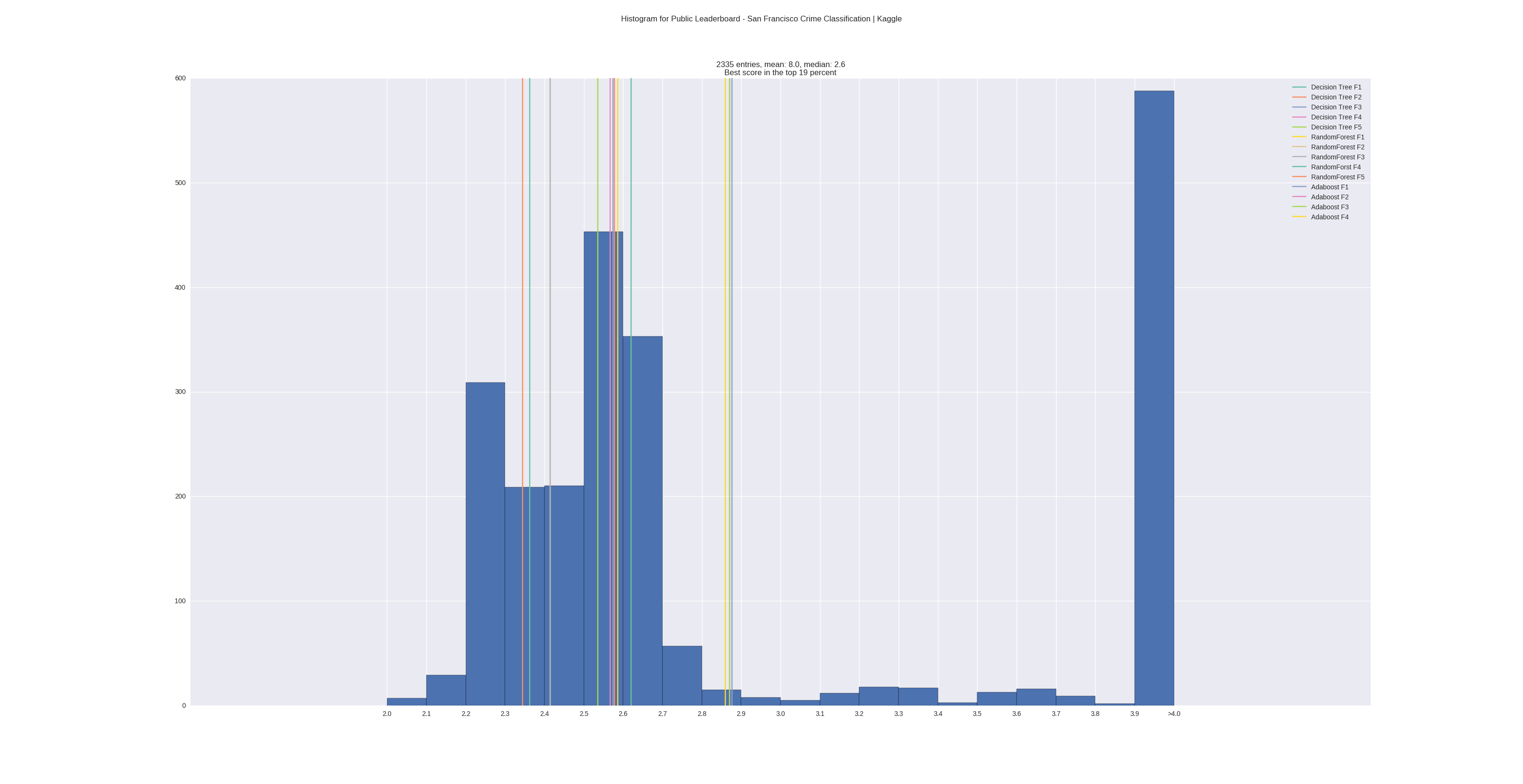 Feature-Sets
- F1 : DayOfWeek, PdDistrict_num, Hour
- F2 : X, Y, DayOfWeek, Hour
- F3 : X, Y, DayOfWeek, PdDistrict_num, Hour
- F4 : X, Y, DayOfWeek, PdDistrict_num, Hour, Month, Year, Day, DayOfYear
- F5 : X, Y, DayOfWeek, PdDistrict_num, Hour, Month, Year, Day, DayOfYear, Streetcorner
Explanation: I chose to use DayOfYear, Month and Year to capture seasonal dependencies, and thought that, even if I do not exploit the adresses to full extent, at least checking if the crime happened at a street corner instead of a regular adress could improve my results.
Scores of classifiers on feature sets (and the top-percent this would give on the leaderboard (of Aug. 28th, 2016)):
- F1:
DecisionTree: 2.62 (top 60%)
RandomForest: 2.59 (top 49%)
Adaboost: 2.877 (top 70%) - F2:
DecisionTree: 2.578 (top 45%)
RandomForest: 2.415 (top 25%)
Adaboost: 3.12 (top 70%) - F3:
DecisionTree: 2.574 (top 44%)
RandomForest: 2.415 (top 25%)
Adaboost: 3.196 (top 70%) - F4:
DecisionTree: 2.567 (top 43%)
RandomForest: 2.363 (top 21%)
Adaboost: 2.869 (top 70%) - F5:
DecisionTree: 2.535 (top 36%)
RandomForest: 2.344 (top 19%)
Adaboost: 2.990 (top 71%)
We can see with sets F1,F2,F3 (I made those experiments to see if the discriminative power of spatial information encoded in coordinates vs. PdDistrict makes a difference) that coordinates perform better than PdDistrict, and both combined give a slight improvement to the DecisionTree, have no effect on the RandomForest, but make the Adaboost-Classification worse.
Including more variables regarding the time of the crimes (set F4) improves all classifiers.
Creating the own variable StreetCorner further improved the result by a small margin.
To conclude, I visualized and cleaned the input data, was able to successively identify features that each improved the classification results, used hyperparameter-search to find a good set of hyperparameters for the chosen classifiers, and finally built a classifier that would score in the top 19% of the kaggle leaderboard of my chosen problem.
Possible improvements given more time:
* Some of the associated addresses of the removed outliers actually were in the SF area, so those adresses could be used to correct the GPS data
* There are 2323 duplicates in the training data, I am not sure yet if it makes sense to remove them or not (it could be several persons that commited the same crime, or an error in the data acquisition)
* Train several classifiers (e.g. RandomForest, Tree, NeuralNet, xgboost, etc.) and combine them in another „hyper“-ensemble with soft-voting
* Visualize the confusion matrix and try got get additional insights
* Visualize the most important variables of the classifiers and try to get additional insights
[1] https://www.kaggle.com/c/predict-closed-questions-on-stack-overflow/forums/t/2499/multiclass-logarithmic-loss
[2] https://www.r-bloggers.com/making-sense-of-logarithmic-loss/